
AI Data Visualization Tools: What To Look For in 2026
Compare AI data visualization tools by file support, chart quality, natural-language prompts, export options, privacy, workflow speed, and limitations.
Ashesh Dhakal
Published May 19, 2026 · Updated May 19, 2026
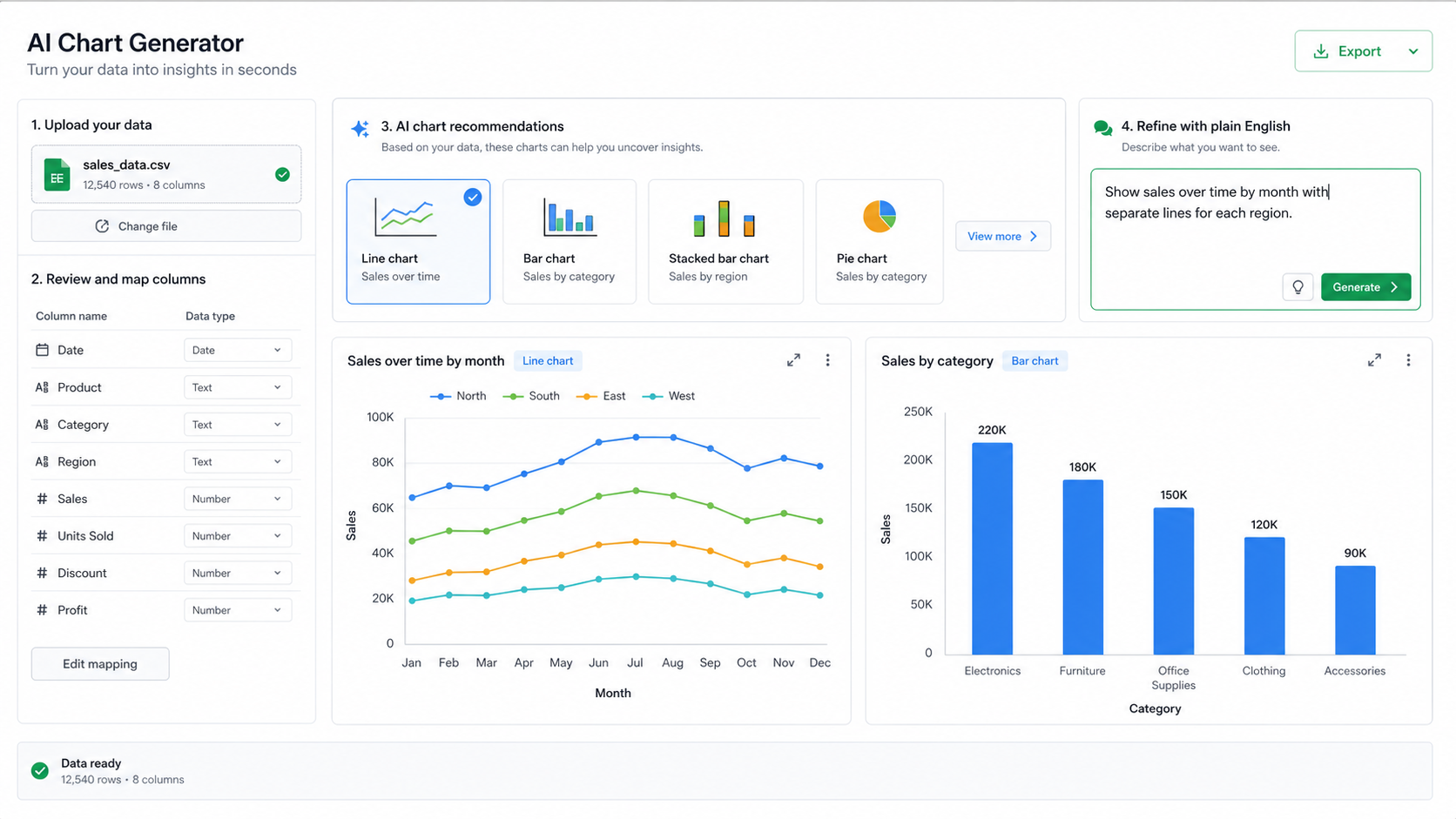
AI data visualization is not just "make me a chart." A useful visualization tool needs to understand the data shape, choose a sensible chart type, map columns correctly, and explain why the chart matters.
This guide explains what to look for when comparing AI data visualization tools and how to decide whether you need a dedicated AI data visualization tool, a spreadsheet chart, a BI platform, or a general AI assistant.
What AI Data Visualization Tools Should Do
A strong AI visualization workflow has five parts:
| Capability | Why it matters |
|---|---|
| File upload | Users should start from CSV, Excel, JSON, or TSV data. |
| Column understanding | The tool must know dates, categories, numbers, and labels. |
| Chart recommendation | Users often know the question, not the right chart type. |
| Natural-language refinement | "Make it a line chart" should be enough. |
| Export | Charts should be usable in reports and presentations. |
| Explanation | The tool should state what the chart shows and what it does not prove. |
If a tool only creates decorative charts from typed examples, it is not enough for real analysis. The chart has to come from the actual dataset.
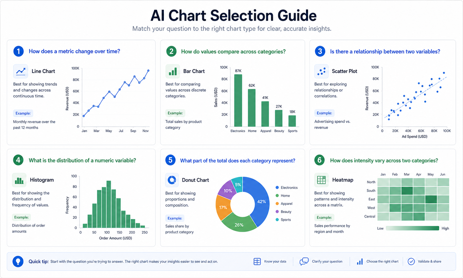
Chart Types And When To Use Them
AI should not pick charts randomly. The best chart depends on the structure of the data and the question.
| Question | Better chart |
|---|---|
| How does revenue change over time? | Line chart or area chart |
| Which category is largest? | Bar chart |
| How are two numeric variables related? | Scatter plot |
| Which combinations are strongest? | Heatmap |
| What share belongs to each segment? | Donut or pie chart, used carefully |
| How are values distributed? | Histogram or box plot |
For example, if your file has date, region, and revenue, a good prompt is:
Create a line chart showing revenue over time, split by region. Explain the trend and point out any unusual months.
If you are unsure, ask:
Recommend the best chart for this dataset and explain why.
Example Workflow
Imagine a spreadsheet with monthly sales by region:
| month | region | revenue | orders | average_order_value |
|---|---|---|---|---|
| 2026-01 | West | 48000 | 640 | 75 |
| 2026-01 | East | 42000 | 560 | 75 |
| 2026-02 | West | 52000 | 690 | 75 |
Start with a broad chart request:
Visualize this data in the most useful way. Show revenue trend over time, compare regions, and explain which chart best supports the conclusion.
Then refine:
- "Make it a line chart by month."
- "Add a bar chart comparing total revenue by region."
- "Show average order value separately."
- "Explain the chart in one paragraph for a report."
- "What chart would be misleading for this dataset?"
This is where a data visualizer AI is useful: it connects the chart to the analysis, not just the drawing.
Dedicated Tool vs Spreadsheet vs BI Platform
Different tools are best for different jobs.
| Tool type | Best for | Limitations |
|---|---|---|
| AI data visualization tool | Fast charts from uploaded files | Not a full enterprise BI stack |
| Spreadsheet charts | Manual control in familiar files | More setup and chart configuration |
| BI platform | Governed dashboards and large data sources | Higher cost and implementation effort |
| General AI assistant | Flexible reasoning and code | Less structured chart workflow |
AnalyzeData fits the fast uploaded-file workflow. Use the AI data analysis tool when you need broader summaries and statistical interpretation, then use the visualization workflow when the next step is a chart. Upload data, describe what you want, generate a chart, and refine it without building a dashboard from scratch.
What Makes A Chart Useful
A useful chart is not the prettiest chart. It is the chart that answers the question with the least confusion.
Look for these qualities:
| Quality | What it means |
|---|---|
| Correct mapping | The axes use the intended columns. |
| Appropriate chart type | Trends, categories, distributions, and relationships use different charts. |
| Clear scale | The scale does not exaggerate or hide the pattern. |
| Useful labels | Viewers can understand the chart without guessing. |
| Honest caveats | The chart does not imply causation or certainty it cannot support. |
| Accessible design | Color, contrast, and labels work for more users. |
For accessible visual communication, do not rely on color alone. The W3C Web Content Accessibility Guidelines are a useful reference when charts will be shared on a website or in a public report.
Prompts For Better AI Charts
The best chart prompts name the metric, grouping, chart purpose, and audience.
| Goal | Prompt |
|---|---|
| Trend | "Create a line chart showing revenue by month. Highlight the largest increase and decrease." |
| Category comparison | "Create a bar chart ranking product categories by total revenue." |
| Relationship | "Create a scatter plot comparing ad spend and revenue. Explain whether the relationship looks meaningful." |
| Distribution | "Show the distribution of order values and identify unusually large orders." |
| Executive summary | "Create a chart and write a 3-sentence takeaway for a weekly business review." |
| Chart choice | "Recommend the best chart type for this dataset and explain why another chart would be worse." |
If the chart matters, ask for the reasoning. "Why did you choose this chart?" is a good follow-up because it exposes whether the AI understood the data shape.
How To Compare AI Visualization Tools
When comparing tools, do not judge only the gallery screenshots. Upload the same small dataset to each tool and ask the same questions. A useful test file should include dates, categories, numeric metrics, missing values, and at least one outlier.
Use this evaluation checklist:
| Test | What good output looks like |
|---|---|
| Column detection | Dates, categories, and numeric fields are recognized correctly. |
| Chart recommendation | The suggested chart matches the question and data type. |
| Prompt refinement | Follow-up requests change the chart without restarting the workflow. |
| Explanation | The tool explains the chart in business language. |
| Validation | It surfaces assumptions, missing values, or outliers. |
| Export | Labels remain readable after download. |
The fastest tool is not always the best tool. A chart that takes five seconds but maps the wrong column creates more work than a slower chart that explains its assumptions.
Common Chart Mistakes AI Should Catch
A strong AI chart generator should warn you when the requested chart is likely to mislead.
| Mistake | Better approach |
|---|---|
| Pie chart with too many categories | Use a sorted bar chart. |
| Line chart for unordered categories | Use a bar chart. |
| Average hiding outliers | Show a distribution or box plot. |
| Dual axes with unrelated metrics | Split into two charts or normalize carefully. |
| Truncated time range | State the date filter clearly. |
| Color-only categories | Add labels or patterns when the chart is shared broadly. |
If a tool never questions your chart request, treat that as a limitation. Natural language should make charting easier, not remove critical thinking.
What To Validate Before Exporting A Chart
Before using an AI-generated chart in a report, check the data mapping and the story the chart implies. A chart can look polished while still using the wrong date column, grouping by the wrong category, or hiding an important outlier.
Use this short review before exporting:
| Check | What to confirm |
|---|---|
| Axis mapping | The x-axis and y-axis use the intended columns. |
| Aggregation | Totals, averages, or counts match the question. |
| Time period | Dates are sorted and filtered correctly. |
| Outliers | Unusual values are visible or explained. |
| Caption | The written takeaway matches what the chart actually shows. |
| Export format | The output resolution and labels work where it will be used. |
If the chart will be used for an important decision, compare one or two numbers against the source spreadsheet before sharing it.
Privacy And File Handling
Visualization tools also need privacy review. A chart may reveal less than a raw table, but the tool still needs to read enough data to create it.
AnalyzeData parses files in the browser before preparing the visualization request. The workflow is designed to avoid an uploaded-file database while still giving the AI enough schema and bounded row context to recommend and generate charts.
For sensitive datasets, reduce columns before visualization:
| Keep | Usually remove |
|---|---|
| Date, category, metric, segment | Names, emails, addresses, IDs, free-text notes |
| Aggregated revenue or counts | Raw transaction notes |
| Region or plan | Full customer profile fields |
The chart rarely needs the most sensitive columns. In most cases, a chart needs only a date, a category, and a metric.
How This Supports AI Data Analysis
Visualization is not separate from analysis. A chart is often the fastest way to check whether an AI summary is plausible. If the AI says revenue increased in Q2, a line chart should make that visible. If it says one category dominates, a bar chart should confirm it.
For tool selection across analysis and visualization, see the best AI tools for data analysis comparison. The best workflow is usually: upload the file, summarize the data, create a chart, validate the chart, then write the takeaway.
Limitations
AI-generated charts can still be wrong. The tool may choose a chart that looks good but hides the real issue. It may map the wrong column, treat text as a category when it should be cleaned, or miss missing values.
For important decisions, check the chart against the source data. For executive reports, finance decisions, legal reporting, or scientific claims, validate the data and chart logic manually.
FAQ
What is an AI data visualization tool?
An AI data visualization tool uses natural language and AI to create charts from data. Instead of manually mapping axes and selecting chart settings, you describe what you want to see.
What is the best AI chart generator?
The best AI chart generator depends on your workflow. For uploaded CSV and Excel files, AnalyzeData is built to generate charts from real datasets quickly.
Can AI choose the best chart type?
Yes, a good AI visualization tool can recommend chart types based on column types and the question. You should still review whether the chart supports the conclusion.
Can AI create charts from Excel data?
Yes. AnalyzeData can create charts from Excel files, CSV files, JSON files, and TSV files.
Is AI data visualization the same as BI?
No. AI visualization is useful for fast chart creation and exploration. BI platforms are better for governed dashboards, large data infrastructure, and repeatable enterprise reporting.
Ashesh Dhakal
Founder & Data Scientist
Ashesh Dhakal is a Data Science student at the University of Manitoba and a full-stack developer specializing in AI-powered applications. He holds a Computer Programming Diploma with Honors. His expertise spans explainable AI, natural language processing, and building production AI platforms.
Related Articles

Best AI Data Analysis Tools in 2026: Practical Comparison
Practical comparison of the best AI data analysis tools in 2026. Compare privacy, file support, speed, charts, workflow fit, and free tiers.

How to Analyze CSV Data with AI: Step-by-Step Guide
Learn how to analyze CSV data with AI using a practical workflow for summaries, trends, statistics, charts, privacy checks, and follow-up questions.

How to Analyze Excel Data with AI Without Formulas
A practical guide to analyzing Excel data with AI, including workbook prep, spreadsheet prompts, trend analysis, chart questions, privacy checks, and limitations.